Wednesday 19 October 2011
Tuesday 18 October 2011
Initial Plans
Initial Plans
Publishing Company: IPC Media
Price: £2.50
Frequency: Weekly
Issue Size: Approx 70 pages
Target Audience: 17-25 years, Male.
Frequency: Weekly
Regular Content: Reviews, New Albums/Singles, New artists
Feature Articles: New Artists
Publishing Company: IPC Media
Price: £2.50
Frequency: Weekly
Issue Size: Approx 70 pages
Target Audience: 17-25 years, Male.
Frequency: Weekly
Regular Content: Reviews, New Albums/Singles, New artists
Feature Articles: New Artists
Saturday 15 October 2011
Friday 14 October 2011
Tuesday 11 October 2011
Friday 7 October 2011
You've Been Framed!
LOW ANGLE SHOT

HIGH ANGLE LONG SHOT

ON THE PHONE

CLOSE UP IN NATURE

ISOLATION

OVER THE SHOULDER

MEDIUM CLOSE UP
LONG SHOT

FRIENDSHIP

ANGER
TIME
Thursday 6 October 2011


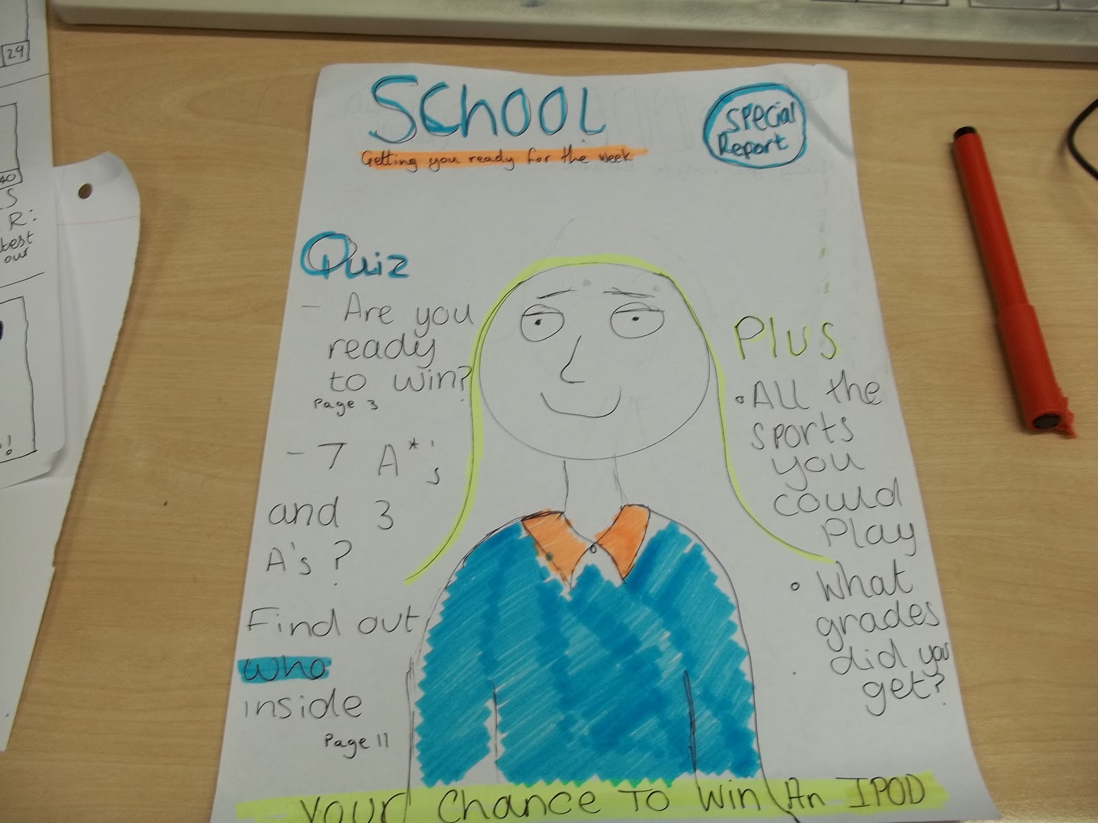
Contents page plan
Contents page
• My contents page is going to have seven different sections
-sports
- whats new
-helping you
-win an ipod
-new facilities
• its going to have 6 different images on it
- Editor
Alex Ruse
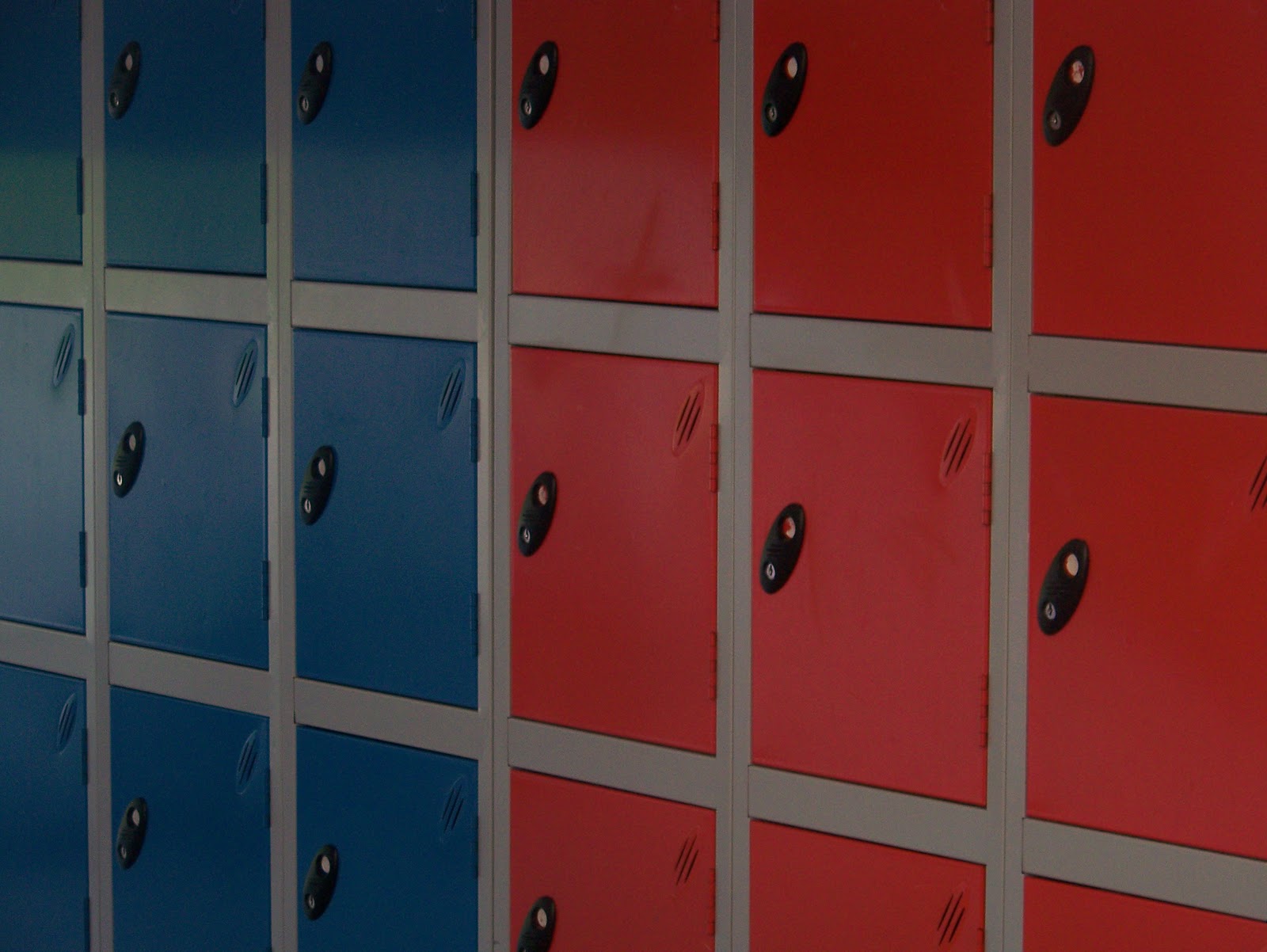
lockers
'block c' sign
'?'
an ipod touch
lockers
'block c' sign
'?'
an ipod touch
Front cover plan
Front cover
• my magazine is going to be called 'School.'
• the main image on the front cover will be a student in her p.e uniform
•i am going to have contact information on the fron page undernieth the title
•i am going to have four main storys
- Alex Ruse, the girl who is on the front
- School results from sports comepetitions
- Results
- Ways to revise

Sunday 2 October 2011
Mise-En-Scene (Put into the Scene) Pictures.

Classical Music

We <3 Pop.

Froots

Kerrang!

NME

Q

VIBE
*These pictures correspond with my other blog post - 'Mise-En-Scene (Put into the Scene)'
Mise-En-Scene (Put into the Scene)
Everything in front of the camera including : lighting, clothing, props, facial expression, colour.
Classical Music
- Medium long shot, background to show where they are (Russia)
Froots
- The Mise-en-scene shows that it's folk music.
Kerrang!
- Mise-en-scene, ironic because though rockers don't seem to eat ice cream because it's sweet and innocent. It also implies that he's cool.
NME
- Linked the masthead with the main story (American Flag)
Q
- The Mise-en-scene corresponds with the headline.
Vibe
- Mise-en-scene is cool, laid back, hard and cool.
We <3 Pop
- Young age group, bright, happy. Shows she's high status because the main article is just her name,
*Go to my other blog post, 'Mise-En-Scene (Put into the Scene)' for the corresponding pictures.
Codes & Conventions of a Magazine Front Cover.
- All have a big central image (mid shot)
- All have the biggest stories of the week, on the front, to catch the attention of the target audience.
- Colourful and bold.
- Pictures and titles overlap (which shows that the magazine is known enough to hide some of the title).
- Price included, usually, on the bottom.
- All have a date the magazine was issued.
- Bar-code on bottom right.
- Cover lines decorated with graphics.
- 4 or 5 cover lines on each, depending on genre.
- Masthead font is unique
- 2.3 fonts
- Biggest story matches image.
- Main image uses direct address.
Subscribe to:
Posts (Atom)