This is my front cover. As you can see i have edited my front cover and it is finally in black and white. I made this change on photoshop. I took the photograph with a nikon D300. The block graphics were done with a shape tool and colour fill on photoshop. I chose to put the picture in black and white because i feel that it has a more mysterious and 'indie' look to it, which is what i was aiming for. The main coverline ' Alex Jane', I feel, stands out well and catches the audiences eye.
I made the 'plus' graphic on the bottom left corner on photoshop also. I done this by making three seperate layers and chaining them together; two circle shapes and one text layer. I then put the grapic on the bottom of the page cutting off the bottom of the shape, making it look like a semi-circle.
In comparrison with the first picture of my front cover, i feel that it has progressed more towards my target and looks more like a professional 'indie' magazine. When the picture was in colour, i don't think the main cover line and other coverlines stood out enough. That is why i made block graphics.
Overall I believe i have followed the codes and conventions of an indie magazine.

On my double page spread I used quark. This is a programme which helps you layout and edit work. I believe that this programme helped me greatly in my work and the presentation quality of my work is much better than it would be on any other programme.
The picture (left) on the page was edited on photoshop and then imported into quark. This, i feel, shows off my ICT skills and shows i can confidently use a variety of computing programmes. I took the picture with a kodak D300.

I done my contents page on quark. This helped my contents page achieve full potential and get at the standard it is at. I took all my photo's with a nikon D300. The 'Alternative' at the top right hand corner of the page is imported from photoshop. I feel that the consistancy of colour and theme is consistant throughout.
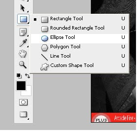
Throuhgout all of my coursework, Quark and Photoshop have been prime factors to achieving the standard of work. I used many tools throughout my work. These inclue the lasso tool, the cutting tool, the polygon tool, the painprush, the cropping tool and the ellipse tool to really enhance my work and make it look like a professional magazine. My favourite tool is the lasso tool. This is because it helped me lap the models head over the masthead, making my front cover looking very professional.


No comments:
Post a Comment